Friday 13 February 2009

Front Cover - First Draft

Front Cover
This is the first draft of my front cover of my magazine. I created this front cover on Adobe Photoshop, as I feel that this software allows me to use many tools, such as the ability to add different layers, add shadow effects and being able to insert pictures, to create a successful front cover.
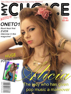
I added a few things to this front cover, which were not previously on the mock up. Firstly, I added the offer 'HUGE POSTER INSIDE!" This was because my magazine was inspired by 90s pop magazines, and all of these, because of the time period, would offer a large poster for the reader. That is why I too decided to include this offer to help persuade the user to purchase the magazine. Secondly, I positioned the selling line more to the top of the page, rather that below the masthead. This was because when I had positioned it below the masthead, it would distract the user from the main image, and this is the image that is going to sell the magazine. Lastly, I decided to add the word 'only' underneath the price. The makes the magazine sound relatively cheap, and therefore persuades the user even more to purchase it.

Mock Up of Front Cover

Mock Up of Front Cover
This is is a mock up of my front cover.
On my mock up, I realised that I had forgotten to include the Issue number and a selling line. These are two important parts of a magazine. The Issue number keeps the user informed and the selling line helps persuade the user to purchase the magazine. This mock up has been extremely useful to me as it means that I can remember to include these things on my real front cover.

Thursday 12 February 2009

Original and Edited Image

Original and Edited Image
These are two versions of the photo that I took for my front cover. The original image is on the left, and the edited version is on the right.

I decided to change my parts of my original image, as I felt that this would not be appropriate for my front cover.
  1. I decided to erase the background and replace it with a white background. This was because the background that I had taken my photo on was irrelevant, and may have distracted the viewer from the main focus of the image, which is the woman.
  2. I used the clone tool to erase her facial piercing. As she is meant to be a ‘pop’ star, it would not be good for her image to have a piercing here. It would also not appeal to the younger members of her target audience.
  3. I added a ‘lightening’ effect onto her necklace. This makes the jewellery that she is wearing appear to be much more expensive and interesting, rather than the original and more dull necklace that she was wearing before.
  4. I had to use the clone tool to erase the words that were on her wristband. I decided to keep the wristband in the image, as it shows that she is into music and attends music festivals. However, it is illegal to advertise any other brands without their permission. It would also not be good publicity for the singer that I am advertising, as it means that their attention could be lost.
  5. I decided to add a shadow behind her, so that it gives the effect that this photo was taken in an actual studio. This looks very professional and more realistic.
  6. I made the brightness and contrast greater, as the lighting in the photo was quite dark. There was also an orange tint over the photograph, meaning that I had to adjust the saturation slightly so that her skin colour was more realistic.
    Making the image brighter highlights the lighter areas of the photo, therefore attracting more attention to it.
  7. I decided to airbrush her face, to smooth her skin. This made her appear much more presentable for the front cover of the magazine. After I had used the guassian blur tool to do this, I used the sharpen tool to emphasise her eyes, lips, necklace and flower in her hair. This makes it far less obvious to the viewer that this image has been airbrushed.
Archive Photos from Photoshoot


Why did I not use these images?
  1. I did not paricularly like the lighting for this image. Because of the time that I took it, there was not natural lighting from the window, and I had to use the lighting that I had indoors. This created a slight orange tint on the image, which looked quite unprofessional.
  2. I chose to take this photo with flash on, because of the problem I experienced while taking photo one. However, i feel that this flash made the model look pale, and light had reflected off the wall behind, which looks quite unprofessional.
  3. I had tried to cover the floor and drawers with a white towel, to make it easier for me later on when I wanted to erase the background. However, I did not place enough white towels around, which made it very difficult for me to erase the background well.
  4. The angle of this image is not particularly good. It is not close up, nor is it a whole body shot. This makes it quite unclear for the user as they do not necessary know where to look. I should have either taken a close up image to attract more attention and make it clearer.
  5. This image is quite unsuccessful. Not only do I have a glare for a light that I had used, but my thumb can also be seen in the bottom left corner. This looks highly unprofessional, and distracts the user from the main focus, which is the model.

Planning my Photoshoot and Mastheads

Planning my Photoshoot
This is the plan for the main image of my front cover. I have chosen to call my magazine "My Choice", as while I was researching magazines, I realised that magazines tend to only be called names made up of 3 or less syllables (for example "Rolling Stones" and "Smash Hits"). This is so that they are more catchy and memorable, and longer magazine names would not easily be remembered.

Possible Masthead Fonts

These are my possible mastheads for my magazine.

  1. The font used for my first masthead it called "A Star is Born". I liked this font because it is extremely different and unique; no other matheads use it. The stars in the letters have connotations that the person on the front of the page is also a 'star' and is extremely famous. However, I feel that this masthead is quite immature, and would not appeal to older members of my target audience.
  2. This second font is called 'Starburst'. I chose this font because the letters are quite big, therefore attracting the attention better of users. However, because of the different lines that cut through the letters, it makes it quite difficult to read. They also have connotations of laser beams, which is does not suit the 'pop' genre of my magazine.
  3. This font is called "Adamgorry". This font is clear and easy to read. It appeals to everyone and is extremely unique. The white dots create the illusion of light bulbs, normally associated with famous celebrities. This would therefore suggest that the person being promoted on the front cover of my page is also a well known star.
  4. This final font is called 'Graphic Attitude'. This font looks as if it has been written by hand, therefore appealing to my target audience of teenagers. However, the use of scatchy lines is not associated with the pop genre of music, therefore not being particularly appropriate.
I have chosen to use masthead three.

[All fonts taken from www.dafont.com]