Friday 28 November 2008

Second Photoshoot

Planning my Second Photoshoot

This is my plan for my second photoshoot, which I will conduct on Friday. The photographs that I take here will be used on my contents page, and will relate to features within the magazine. Each photograph will be placed on the second page of my table of contents, with the page number written next to it.

(please click to enlarge)

Friday 21 November 2008

Contents page Mock Up

Planning my Contents page
Here, I have designed the mock up of my contents page. I have used the same colours and font style as my front cover, so that my magazine can be consistent and recognisable by the readers as the school magazine's.

(please click to enlarge)

Magazine Front Cover

Front Cover

This is my front cover for the preliminary task. I created this front cover on Adobe Photoshop, as I feel that this software allows me to use many tools, such as the ability to add different layers, add shadow effects and being able to insert pictures, to create a successful front cover.

Whilst creating this cover, I had to keep many things in mind. Firstly, the colours that I used had to be the school house colours, which are green, white and yellow. I will use these colours throughout my magazine so that I can be consistent. Secondly, I had to bear in mind the rules of third. I purposely placed my model in the two right thirds, to keep the first third empty for the kickers. I also directed my model to hold the notepad quite high, so that I could place the competition box against a plain background and not confuse the viewer. Thirdly, the fonts I used had to be different, but not be too different so that they distract the reader. That is why I chose to only use three different fonts on my cover. This made it interesting yet not too overwhelming.

Friday 14 November 2008

Mock Up

Creating my Mock Up

(Please click to enlarge)

Why did I choose this font style?
I chose the font 'Arial', as I felt that this font style is extremely easy to read by everyone. I need to make sure that it is a clear font to understand, so that the younger members can read the text easily as well as the older students.

Why did I choose the colour green, yellow and white?
These are my house colours. They are also the colours of St Marylebone School, and so by using these throughout, my magazine is easily recognisable as being the school's magazine.

Thursday 13 November 2008

Preliminary Task

Planning my Photoshoot 06/11/08

This is a plan for my photoshoot. It describes what I am going to do for my photoshoot, and what I want to achieve from my photos.

(Please click to enlarge)


Photos for Preliminary Task 07/11/08


In this lesson, I took multiple photos for my school magazine front cover. I feel that this task was done quite successfully, however there were some aspects of it that I would change for next time. Firstly, I would have taken many more photos to try and get the most successful photo that I could possibly get. I only took three different photos, which were all taken in the same lighting and position. This wasn’t very varied, and I feel that if I had experimented more, I could have come up with a much more interesting photo with different lighting, stances, facial expressions etc. Also, some of the photos I took were not very appropriate. This one, for example (right), the flash was kept on. This means that there were many shadows around the edges of the wall and around her body. This would have made it difficult for it to be successfully Photoshopped out and edited.Secondly, I would have drawn out my design better. This would have given me a clearer idea as to what I wanted my magazine cover to look like.
Using Brushes 10/10/08

In this lesson, we learnt how to download brushes to create a successful banner and logo for our media blog. We first downloaded a Photoshop brush from a website. I found the website Brusheezy, which allowed me to download brushes for free.
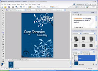
I then started a new Photoshop document from scratch, and adjusted the size to A3. I decided to make my logo and banner using different floral patterns. I made the background a deep blue by filling it with the paint bucket tool. I then loaded my saved brush, changed the paintbrush colour to white, and ‘painted’ where I wanted my flowers to be on my page. I only clicked the mouse once, as this created a sharp and accurate picture of the design that I had chosen.
I then added another layer. This allowed me to draw even more brushes and designs, but I could layer them on top of my previous ones. I then adjusted the blending mode of this layer to luminosity, as this created a very transparent and more subtle effect, which I felt looked extremely professional.
I lastly added my text. I made my name bigger than the text that read ‘Media Blog’, by highlighting the layer that was just my name, and making the font size bigger. I also placed the ‘media blog’ layer below the text layer for my name, so that my name slightly overlapped the other text. This looked made my logo look very professional.
The font I chose was a script font, as I wanted to keep my logo very sophisticated. The font I used was ‘Pristina’. I also made the font white so that it contrasted well against the blue background a stood out.
I also added a drop shadow to both text layers, which just makes my logo look a lot more interesting.
I then created a new document, adjusting the size so that the length is a lot longer that the height. This is my banner. I chose to keep the background colour and used the same brush, as I wanted to achieve a consistent style.
Signs and Semiotics 10/10/08

In this lesson, we learnt about signs and semiotics. I found out that the three main semiotics are icon, symbol and index. Icon is where the sign looks like what it represents, such as a non-smoking sign. This is easily recognisable and the viewer can clearly understand what it means. A symbol needs to be culturally learned, such as a thumb up. Once this symbol is learned, most people will understand what it is. Lastly, an index is suggestive and connected to what they represent, however it can be interpreted in many different ways, for example, smoke is a sign of fire.

Airbrushing

Airbrushing
In this lesson, we learnt about air brushing, and how to change certain features of a person, for example eye colour and hair colour. We did this on Photoshop, using many tools such as cloning, the eraser tool and changing the opacity.


Image before


Image After I have airbrushed using Photoshop

(Top image was before, and the bottom image is after).


As you can see, I have changed many features of this woman. Firstly, I have airbrushed her skin, and removed any imperfections using the cloning tool. I added another layer and used the Gaussian blur tool to make her skin smoother. I then erased the eyes, lips, nose ring and earring from the new layer, so that it appears much sharper. This makes the image look much more realistic, and it appears that she does in fact have skin this smooth.
I then changed the eye colour to a darker blue. I added a new layer and used the Select tool to outline her eyes. I then coloured them in with a dark blue using the paint tool. To make them appear much more realistic, I changed the layer style to Overlay, which made the colour a lot more transparent and subtle.Lastly, I changed the hair colour to a lighter blonde. I did this the same way as I did with changing the eye colour, except I coloured it in with a yellow colour.

Colouring Effects

Colouring Effects

In lesson four, we looked at colour filtering in Adobe Photoshop. This tool makes the image much more interesting to the viewer. I used colour filtering when editing a photo I took for a ‘Skins’ advert.
I did this on Photoshop by changing the Hue and Saturation of the background layer to
-70, adding a new layer and changing the blending mode to soft light. This means that when we colour it in using the paint tool, the image is still visible through the colours. To make this image look much more official, I added text that read “All New Skins” and I added the E4 logo, by saving the image from the internet and importing it into Photoshop.

Monday 10 November 2008

Fonts

Fonts
In Lesson three, we learnt about different types of fonts, which included:


We then learnt how to download different fonts from websites, such as ‘Dafont’ and ‘1001freefonts’.
We learnt about the effects that these fonts can have on the viewer.


For example, you can use a grunge font if you were advertising a topic such as acid rain. As you can see, this looks like it is corroded and has been worn away, which also represents the effects of acid rain.

Colour Filtering

Colour Filtering/Colour Popping

In our third lesson, we learnt about ‘colour popping’. This is where we select a certain colour and make the rest of the colours black and white. This is a good tool for when you want to highlight a certain part of the image, so that if that is the only part that is in colour, the viewer’s attention will be drawn to that section.

In this example, I have chosen to leave the hand in colour and the make the rest of the image black and white. This draws the viewer’s attention to the hand that is stealing from the girl, which is also the theme of this poster.

I have also made the text in colour so that this and the hand both make the viewer completely aware of what the poster is advertising.

Cloning

Cloning
In the second lesson, we learnt how to use the cloning tool. Cloning is a technique used on Adobe Photoshop, and it involves copying a section of an image exactly to another part of the same image. We used cloning to erase certain brands that were in a photograph we took of students at St Marylebone. These are the before and after shots:


As you can see, I have managed to erase brands such as “Dior” and “Zara” from the students’ bag, as we cannot advertise corporate brands in the school prospectus. I have also cloned out the woman from the stairs so that she is not distracting the viewer’s attention from the actually students. I have also used the ‘crop’ tool so that the focus can be entirely on the students.

Image Analysis

Image Analysis
In our first lesson, we learnt about how to analyse images, looking at the denotation and connotations of the image.
For example, in this advertisement for DKNY’s perfume range, we can see that the image is split in two. On the left is the more official page, with the logo, the perfume bottle and the slogan. The perfume bottles are also clearly positioned in the centre of the page. This is called framing and the editors choose where they position items for a purpose.
On the right hand side of the advertisement, we can see two models (one male and one female), and the woman is eating a green apple. As the new DKNY perfume is meant to resemble an apple in scent, shape and colour, the apple the woman is holding is also meant to symbolise the actual perfume. The lighting used in the image on the right is very warm and has a tint orange to it. This colour has been added to resemble the colours of the apples that are positioned on the left, hence making the whole advert focus on the perfume.
We then learnt about camera angles. For example, the image on the left has been taken as a close up camera shot. This allows the viewer to see the apples surrounding the perfume extremely close up. At this angle, we can see all the shades of the apples and the water droplets that are on them. These droplets have been added to make the apples look extremely irresistible and delicious, which reminds the viewer of what this poster is advertising.
All of these choices have been made for a reason. What we can see in the image is the denotation and the reasons as to why they are there and what they mean are the connotations.

Introduction

The first entries of this blog have been back dated over the previous weeks.