Tuesday 8 December 2009

Alfie

Alfie, similar to John Tucker Must Die, is also about a man, this time in his late twenties, who lives in Manhattan and works as a limousine driver. He too lives a hedonistic lifestyle "meeting, romancing, and seducing women" as a hobby.

As the trailer opens, you can immediately see the different audience that Alfie is targetting. First of all, the music is a laid back sort of jazz which is completely different to the more upbeat and technologically advanced track played in the opening of John Tucker. It also shows Alfie, a working man travelling alone in a city, and not at an American High School. This immediately suggests that the target audience is much older, probably women aged between 20 and 35 years of age. Also shown in the beginning seconds of the trailer are clips of Manhattan and its skyline. This immediately sets the scene that it is based in America. However, Jude Law, the character who plays Alfie, is an English -born actor. By casting a British actor to appear in this American film it is clear that it is going to be released internationally, therefore intending to appeal to a much wider audience.

There is a much clearer message that runs throughout this film, and as a viewer, I picked it up much more quickly then I did with John Tucker, which I feel is purely just a film for entertainment value. 'Alfie' possesses much more serious issues, for example the cancer scare that Alfie has during the film. He teaches the audience not to be so shallow and to enjoy every day as if it were your last.

John Tucker Must Die

'John Tucker Must Die' is an American film of the genre 'romantic comedy'. Released in 2006, it focuses on three girls who want to get revenge on a boy in the year who has secrely been dating all three of them.

The trailer begins with clips of John Tucker playing basketball in an American High School. This immediately suggests that the target audience is probably females aged between 14-19 years. The music playing is also a song by the All-American Rejects, which not only relates to the plot of the film, but also appeals to the modern day target audience of young teenagers. As the trailer continues, we hear a voice over of the second -to-lead character, who describes to the audience the situation. The different shots cut quickly into each other, which adds to the whole chaotic atmosphere of the basketball game, and appeals very much to the younger audience who would have no problem keeping up. The language used by the character also appeals very much to the target audience, using phrases such as 'She's so hot!".

It is clear that this film is a modern adaption of the film 'Alfie', aimed at a much younger audience. However, it was given an age certificate of PG13 in America, due to the amount of sexual references throughout. We want our film to appeal to those between the age of 13 and 18 years of age, meaning that it would receive a 12A rating. This therefore means that we need to be careful when referencing anything of a sexual nature.

Friday 4 December 2009

Where I am now

My Role:
What I have done this week: 30th November - 4th December
At the beginning of this week, I was in charge of creating a moodboard for our film 'Nick'. I created this moodboard on Animoto, as this website allows for you to create a short video with exciting and interesting effects. In our moodboard, I decided to include images from other films where we have gotten inspiration from such as 'Alfie' and 'John Tucker Must Die'. I also included images of locations where we would like to film, such as Central London and Starbucks Coffee house. This particular location of central london, and filming in coffee shops such as Starbucks really gives a good impression of where the main character is from and the life he leads. He is extremely busy and earns quite a high salary, due to the fact he lives alone in the central of London.

I have also been in charge of drawing a storyboard and creating an Animatic for our film, based on Susan's (a member of my group) shotlist that she provided. However, the story board does vary slightly from the shots that she gave me as we wanted as many different ideas as possible to make sure that our final shotlist is the best one.

When drawing the storyboard, I remembered to keep all the boxes the same. This was so that when I come to creating my animatic, it flowed better and looks much more professional. I remembered to include every single shot, even drawing a character's movements for example if someone is walking. The more frames you include, the more realistic your final animatic will be. Once I had finished scanning in my images (I chose not to photograph them as the lighting would change for every photo I took), I then cropped them on Adobe Photoshop to make sure that they are all identical in size. I then imported them each individually into Windows Movie Maker, where I set the transition to less then a second. This means that when I played my movie, the images would move extremely quickly and look like real moving footage. I then added some jazz music into the background, which reflects the lead character's personality (laid back and easy going). However, this music that I used was in fact the ssample music already given to me on the computer. Although I felt that this still worked quite well, I could have used a more unique song to make my animation different from anyone has ever seen of heard before.
I used Vimeo to upload my video and copy the code onto my blog.

Next week, I am going to be present when my group is filming, giving my advice and watching to see how it is all going. The next time I will have an active role will be when all footage has been filmed and I will begin editing it on the computer.

Sunday 29 November 2009

Animatic Video

I created this animatic which gives viewers an idea as to what our film teaser trailer will look like. I drew each image individually in the same sized box, so that when I did eventually put the pictures together, it looked as if it were moving. Although this process was quite long and required me to have a lot of patience, I feel that it was worth it as the final result was quite successful and gave a good impression of what our final teaser trailer should look like.

I created the actual animatic in Windows Movie Maker. I did this by making the duration of each images about 0.75 seconds, so that the images would flick from one to another extremely quickly. This gave the impression of movement. I then added a song by the band 'The Script', as I felt that this slow and romantic music fitted in well with the genre of the film.

Sunday 22 November 2009

MoodBoard


This is my moodboard that I created using Animoto. I decided to include many images of London City, as this is where we want our film to be set. By choosing well known landmarks, viewers will also be able to clearly see that this is a British film. I also included some images of films that inspired us when we were creating the synopsis to our film. The music that I chose for this moodboard is extremely upbeat, and the lead singer has quite a strong 'cockney' accent. This again highlights the fact that our film is a British film. Inspiration came from films such as Alfie and John Tucker Must Die.

Thursday 12 November 2009

Final Presentation


This is an updated version of the presentation that you can see below. I have basically just changed the layout of it, making it much more visually interesting and professional for the viewers.

Friday 23 October 2009

Research and First Media Presentation

As a group, we sat down and came out with an idea for our film.

Synopsis
The genre of this film is romantic comedy, and it is set in 2010. The film focuses on a young man in his early 20s, who dates three different women simultaneously. These girls are unaware of the fact that they are all seeing the same man, and the film follows how he gets away with dating all of them. Eventually, two of the girls meet and its later worked out what he is doing. The girls get together and work out how to take the revenge, with them finally confronting him.

Target Audience
The target audience for this film we decided would be be females aged between 15-23 years of age. They enjoy watching romances, yet they also watch films to be entertained. They are either students or women with quite low powered jobs, and are likely to watch the films in the evening after a long day at work. They are unlikely to see the film in the cinema, preferring to watch it on DVD in the comfort of their own home.

Questionnaire
Although as a group we felt that we had chosen a suitable target audience, we wanted to make sure that our target audience was in fact interested in our film. We therefore created a small questionnaire and asked 10 males and 10 females between the ages of 16-18 some questions to help us determine whether or not we were in fact aiming our film at the right audience. These were our results:


As you can see, 90% of women would be highly interested in our film, whereas only a mere 30% of men wouldn't. This shows that we did in fact choose the right target audience for our film.

Below is a presentation that I created which is a summary of what our film will feature.

Nick
View more presentations from lulubee.

Tuesday 28 April 2009

Final Productions

I have changed three aspects of my last front cover. These are:

  • The date. I realised through doing more research that most magazines only show the month and year of when it was published, and not the specific date. To make my magazine more professional, I decided to change the date, which is located near the barcode, to '09 February 2009' to just 'February 2009'
  • I added a button to highlight the price. This button is round and filled with the colour yellow, which is one of my house colours. I decided to place the price in a button so that it stood out more and attracted a lot of attention, as this price is relatively low for a weekly pop music magazine
  • The font for my 'ONETO1' coverline. I decided to make this font a lot more bolder and exciting, to appeal to readers much more and stand out better. The font that I had chosen before did not attract a lot of attention, and may not persuade customers to purcahse it
Contents
View more documents from lulubee.

The aspects of this magazine that I have chosen to change were:

  • The page number. I had previously positioned this in the bottom left corner with an website address, yet if I was following my standard pattern of the website address only being shown when it is the page on the left, then this would not consistent. I therefore positioned the page number of this contents page, which would be positioned on the right page, into the bottom right corner, so that I am consistent and professional
  • Article number 23. This text overlapped the special competition, which was positioned beneath it. This made it slightly confusing to the reader, and takes away the attention from the exclusive offer. I therefore deleted article 23, so that all text on my contents could be easily read
  • The Michael Jackson tickets. I had previously positioned the word 'fake' over both tickets, which made them look as if this 'fake' was actually printed on the tickets in real life! If they were, then clearly they would be fake. I therefore decided to place this word over one ticket, to show that my company has placed the word there to show that they are indeed fake, even though they still look like the real tickets

Friday 24 April 2009

Final Evaluation Presentation

Final Evaluation Presentation


Lucy Cornelius Media Studies Evaluation from St Marylebone Media Studies on Vimeo.

Since presenting my final evaluation, I have added some information about my preliminary task.

From my preliminary task, I learnt many things to improve my documents.

  • I learnt many more technical skills. This included using websites such as Dafont.com to download unique fonts for my magazine. I also used the cloning button to erase any imperfections, for example blemishes on her face.
  • I included a bar code, to allow for my magazine to be sold in shops.
  • My research was much better, and i used more standard conventions of 90s magazines, for example offering a free 90s poster.
  • I only displayed the month of which the magazine was sold in, rather then included the actual date of that day.

Friday 20 March 2009

Evaluation

1. In what ways does your media product use, develop or challenge forms and conventions of real media products?
Front Cover
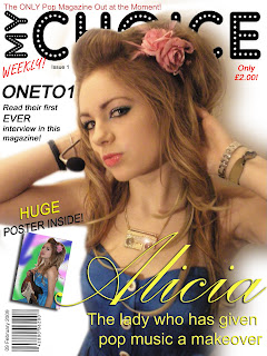
My front cover uses many forms and conventions of real media products. Firstly, I have included a masthead for my magazine. The name of my magazine is “My CHOICE”. I was inspired to create this name by other magazines, such as NME and Smash Hits. Most magazine names are made up of only two or three syllables, so that it can be short, catchy and memorable. ‘My CHOICE’ is all of these things, and so would probably be remembered well by customers. The font of my masthead is “Adamgorry”. I chose this font because it was clear and easy to read by all users. The dots inside the words have connotations of fame, like spotlights. This emphasises how this magazine is theirs, and that they’re the star. Although this sounds quite immature, it would appeal to my target audience of girls aged between 10 and 15 years.
The strapline for my magazine is located above the mast head, in a bright red font. This attracts a lot of attention, and once read, would persuade users to purchase the magazine. The strapline for this magazine reads “The ONLY Pop Magazine Out at the Moment!” This makes users feel that this is the only pop magazine on the market, and so if they want a magazine of this music genre, this is the only one for them.
Another form and convention that I have used are coverlines, kickers and explanatory text. The main cover line reads “Alicia”, and is the name of the model is in the main image. The font I used for this was a decorative font, which looks extremely elegant and sophisticated. Also, because of the curves, it looks extremely feminine, which has connotations that the female artist being promoted aims at women and girls, rather than males. The font colour of this text is yellow, which stands out extremely well. It is also a very bright colour, which shows that ‘Alicia’ is a very upbeat and fun character. The explanatory text is located underneath this cover line, and describes what ‘Alicia’s role is in the music industry.
I have chosen to only use one kicker on my magazine, as I want the main focus of the audience to be on the main cover story, which is ‘Alicia’. I positioned this kicker, which is about the band “ONETO1”, in the left third. The font colour is black, which contrasts well with the white background, making it stand out well. The explanatory text tells readers that this is the band’s first interview, and by putting the word “EVER” in capitals, makes the readers realise this quicker. I feel that I could have, however, had another kicker underneath this one, to give readers more options to choose from to help them decide whether they want to purchase the magazine. This is because if readers are not interested in the main cover story or the story about “ONETO1”, they have nothing else on the page that would make them want to purchase it. Most standard magazine have about six kickers and coverlines, and I only have two, which is definitely not enough. Here, I have therefore challenged a standard convention of real media products.
I have also made clear on the front cover that there is a “HUGE poster inside!” This was a standard convention of 90s pop magazines, and during these times, readers would put these posters up all around their room. I emphasised ‘huge’ by putting it into capitals, so that users are aware that if they buy this magazine, the poster will be of an extremely large size.

Contents
On my contents page, I have used many standard conventions, to make it look professional for the readers. I have included the date and issue number, so that the audience are well informed. I have also included page numbers and given a description of what each page featured will have. This means that it is easier for users to decide wheat they want to read and easily locate it withint the magazine. I have developed the standard form of page number by making the numbers for images bigger. This is sometimes done in other magazines, yet they are not normally this big. I also changed the colour, which is not normally a standard convention.

Another standard form that I have included is the music magazine's website address in the bottom left corner. It is extremely common for the address to be located here, as it means that they are receiving much more advertising, increasing their audience.

Double Page Spread
My double page spread uses many forms and conventions of standard double page spreads. Firstly, there is the use of a slug in the top right corner of the second page. This slug reads “EXCLUSIVE INTERVIEW”, and is written in capital letters. This attracts attention, and makes the user aware that this interview is exclusive to ‘My CHOICE’ magazine, which may make them want to read it more. Secondly, there is the use of a pull quote. Pull quotes are meant to make readers want to read the article. I positioned my pull quote in the bottom right corner, as this is where users look when they are about to turn the page. Hopefully, they will read this quite humorous quote, and be persuaded to read the rest of the article. Thirdly, I have taken a photo of ‘Alexa’, and positioned it on the right. This is because this image would attract much more attention, and so by placing it on the right page, users will see it first and would then want to read the article. The model in the photo is smiling, which has connotations that she is kind and friendly. The black and white make the image look extremely professional, which makes the magazine look much more sophisticated. Lastly, I have positioned the byline that reads “Images taken by MediaProductions”. By having this byline of my page, it means that my images are copyright, and no other companies can use them.

2. How does your media product represent particular social groups?
Front Cover
My front cover targets females of quite a younger age, probably from the years 10-16. The model on the front is a teenager of 18 years, and so she would appeal to this sort of age group. Her pout is extremely stereotypical and strongly represents girls of this age. The language used is extremely exclusive, and would probably appeal to everyone who likes the bands that are being promoted.

Contents
My contents page appeals to a large group of people. There is an image of a young teenager, to appeal to the age group of 13-16 years. There is a guitar to appeal to musicians in bands, and there are images of fake Michael Jackson in the top left corner, which would appeal to anyone interested in this type of music.

The colours used are red and yellow, both appealing to any gender. The fonts used also appeal to all readers, as it is a sans serif font and of a black font colour.

Double Page Spread
My double page spread appeals to young girls, but may also appeal to mothers as well. Not only does the pull quote mention how 'Alexa' is signing autographs for older women, but these mothers may also have children this age, and want to know what another woman's daughter is going through, compared to their own.

3. What kind of media institution might distribute your media product and why?
This magazine would probably be published by IPC media. This magazine publisher owns many different magazines, which includes music magazines. The three that they own are NME, Guitar and Uncut. These are all very differnt to my magazines, meaning that there is a place in the market for something new and exciting. Also, these music magazines they own range from £2.20-£4.30, meaning that my £2.00 would probably attract more attention and be quite popular (as it is the cheapest out or the magazines that IPC Media own).

4. Who would be the audience for your media product?
The audience of this magazine are females from the ages of 10 to 17 years. This is clear by the use of females for the main cover image and double page spread, and the average age of them, which is 16 years. The font for the main cover line is extremely feminine, and woul dnot appeal to males.

5. How did you attract/address your audience?
Front Cover
My front cover attracts quite a lot of attention from users. This is mainly due to my magazine house colours of red and yellow. These colours are both extremely bright, and when put together, they contrast greatly, therefore attracting a lot of attention from passers by. What also attracts attention is the medium shot of 'Alicia', and her strong eye contact with the readers.

Contents
Attention is attracted to this contents page mainly by the colours. The red and yellow contrast well against the white background, which attracts attention. Also, the main image of "Alexa", because of the size of it, attracts a lot of attention from the audience.

Double Page Spread
What mainly attracts attention my double page spread is the image, heading and pull quote. The image is extremely high quality, and takes up most of the right page. This instantly attracts attention from the user. The heading is in a large size, and the font is extremely unique. This attracts attention as it is not a standard font that people will recognise, making them look twice. Lastly, the pull quote is also in a big font size. Yet the colours are also split in half. This is so that the words can be read easily, and contrast well against the background.

6. What have you learnt about technologies from the process of constructing this product?
I have learnt many techniques whilst constructing this magazine. The technique that I felt most useful was the magnetic lasso tool on Adobe Photoshop. This tool allowed me to highlight sections of images and delete the background, which came in extremely handy for my front cover when I needed to delete the background of my photo. Also, the clone tool was extremely helpful in deleting unwanted areas. For example, I used this tool to delete the 'Reading' words on Alicia's wristband, and the blemishes on Alexa's face to make her appear even more youthful than she is.

7. Looking back at your task, what do you feel you have learnt in the progression from it to the full product?
I feel that the main thing I have learnt is that it is extremely useful to produce drafts. In my preliminary task, I did not create many drafts, and so my final product probably wasn't as good as it could have been. However, in this project, I made sure that I created at least two drafts of each document, so that it could be an extremely successful final product.

Final Double Page Spread

This is my final double page spread, which I feel is quite successful. I have used many standard forms and conventions to make my document look professional.

Firstly, there is the heading. I chose to use a font called 'Hand of Sean' from the website www.dafont.com. This font is similar to that of handwriting, which has connotations of young students. This reflects the artist that the double page spread is featuring, therefore making it look as if she has written the heading her self. Also, the words "Say hello to the new girl in town..." suggests that she is a new artist, which would appeal to those who always want to be kept up to date as to what is happening in the music industry.

Secondly, there is the image, positioned on the right page. I decided to place this image here for quite a few reasons. One of those is because this page is normally looked at first when readers are flicking through a magazine. By placing a strong close up image on this page, it is much more likely to attract their attention and make them want to read the article. Secondly, I decided to place this image here so that it takes up the entire page because this was extremely typical in 90s pop magazines. Readers would often want to tear the page out and stick the poster on the wall, and if I had made my image any smaller, users would not have been able to have done this.
I made many decisions when photographing this particular model. Firstly, I made her look into the camera. This was because users would be more attracted to it, because she is making eye contact with the reader, but also because she looks extremely youthful and innocent, which is what her image is. Another decision that I made was to make her hair 'windswept' slightly. I did this because it has connotations again of innocence and even makes her look slightly angelic, which is what she is meant to be seen as for her to appeal to her audience of young children and their family. I decided to make the image black and white, because I feel that it attract much more attention. If the entire magazine is in full colour, this feature will stand out and make people stop to read it. I also used text wrapping to make the image stand out well on the page.

Thirdly, I included 'paparazzi' style photos. This was so that they gave readers an idea of the lifestyle that she is living. I decided to not use flash when taking these photos, and set the mode on my camera to 'continuous shooting' so that they would be blurred and have a slightly blurred trail. This was so that they looked as natural as possible.

Lastly, I positioned the pull quote in the bottom right corner. This is because this corner is where they look when they are about to turn the page, meaning that if they had flicked past this article, they would read this humorous pull quote and be drawn back to the article and maybe this time read it.

I have also included other standard forms to make my double page spread professional. This includes page numbers, a slug (located int he top right corner), text and the company website.

Second Photoshoot and Final Contents Page

Second Photoshoot for Final Table of Contents

This is my final contents page, which I feel is quite successful.
  • I have kept to my house colours of red and yellow, and chosen to use a white background to make them contrast well and attract the readers attention better. I have also used a sans serif font so that all text is easy to read. The features are clearly listed with the page numbers positioned next to them. This makes it clear for the user to follow and understand.
  • I have included three graphics to make the page appear much more visually interesting and exciting. Without graphics, the page would not attract a lot of attention, and because of the age of my target audience, they are likely to get easily distracted if there are no images.
  • Positioned at the top is the issue number and date. This means that the user can be kept well informed and up to date.
  • Cover stories are highlighted by the phrase "___COVER STORY". This is a unique way to inform the user of the features that are on the cover, meaning that it will attract attention more quickly, and readers are more likely to look at those pages.

Friday 13 March 2009

Final Front Cover

Final Front Cover
This is my final front cover.

The aspect of this cover that I have changed from my first draft is the main image. I have moved it down slightly, as it was covering more that 50% of the masthead, which would not normally happen. This is because with more than 50% covered, people will find it difficult to read. It will also mean that it is less memorable, and so therefore the user will not recognise it if they saw it on the shelf. This is not good for my company, as it means that our sales could decrease.

I feel that this front cover is quite successful. I have used two main house colours, those being yellow and red. These colours are known in the media industry for working well together to attract attention. They are highly contrasting, which make them extremely eye catching. Music magazines, such as NME, and even gobal food companies such as McDonald's use it for their logos. I have used these colours for my magazine so that it would stand out extremely well on the shelf in a newsagents, for example, and make people want to purchase it.

Secondly, I have included all necessary information to make the document professional. This includes the bar code, price, issue number etc. This gives it a much more realistic feel to it as well.

Thirdly, I have a used an image that is of a high quality, which makes my front cover clear and professional looking. I have also kept the amount of different fonts to about four, so that the reader isn't too overwhelmed.

If I were to approach this task in the future, I would probably have included more coverlines. If the reader was not particularly interested in the main cover story, then there is nothing much else on the page to persuade the user to purchase the magazine. If I included more cover lines about different features within the magazine, there would be more options for the customer to choose from, increasing the chance of a sale.

Double Page Spread

This is the first draft of my double page spread (DPS). I decided to do my double page spread on a 14 year old teenager, who is about to become a famous singer. I chose to focus on this topic as I felt that the story was extremely unique, and would make people want to read it.

I feel that this double page spread is quite successful:
  • The main image on the right looks extremely professional, which makes my magazine look quite sophisticated. I used strong lighting to highlight 'Alexa's' face, and dressed her in darker clothing so that there was great contrast in tones and she would stand out much better on the page. I asked the model to smile, as this would appeal to the right target audience, and would give the impression that she is friendly and innocent. To emphasise this innocence, I also created a 'windswept' effect to make her look almost angelic!
  • The heading is written in a font that looks very much like handwriting. This reflects how young Alexa is, and makes it look much more personal to her.
  • I have positioned the pull quote in the bottom right corner. This is so that if users were quickly flicking through the magazine, they would look at this corner before turning the page. If they read this quite amusing quote, they may be pulled back and want to read the actual article. Also, I changed the colours of this pull quote, so that all text could be clearly read by the user, making my magazine user-friendly.
  • I used text wrapping, so that more attention is drawn to the image on the right. This is because it is the image on the right which will mainly draw the user's attention, and I need readers to be quickly attracted to this to make them want to read the article.
  • I have included the magazine's website address in the bottom left corner. This is more advertising for the company, and users who may not have known that they had a website will be able to realise here and 'My Choice's' audience may increase.
  • The slug is located in the top right corner of the second page, and it read "EXCLUSIVE INTERVIEW". This makes the user realise that this story is only exclusive to the 'My Choice' magazine, and they are more likely to purchase this magazine as it is the only magazine that offers this story.
However, some aspects of it need to be changed. Firstly, some of the text is not aligned properly, making it look unprofessional (for example the word 'privacy' in the third paragraph). Secondly, there does not need to be a byline reading "Images taken by MediaProductions". I added this to make my document professional, yet because there is not a company called "MediaProductions", it would not be necessary for me to place this on my double page spread.

Monday 9 March 2009

Mock up for Double Page Spread

Mock up for Double Page Spread
This is the mock up for my double page spread on 'Alexa'.


I have taken into account many standard conventions of double page spreads, to make mine as professional as possible. This includes the use of a slug, pull quote and drop cap. It also includes the use of text wrapping. I have chosen to make the text wrap around the image, so that it attracts a lot of attention. This is because users will only probably be interested in this article to read about how young this new star is, and the only way they will realise how young she is is by seeing her in this photograph. That is why I have used text wrapping, enlarged the image to a whole A4 side and placed it on the right, as this is the page readers look at first.
One thing that I will change about this mock-up is the position of the pull quote. I feel that I should position this on the bottom right page, as this is the place readers look to turn the page. If they have just skimmed over this article, the pull quote will grab their attention and may even persuade them to look back the article.

Photoshoot for Double Page Spread

First Draft Contents Page

First Draft Contents Page
This is the first draft of my contents page for my magazine.

  • The contents page is laid out well. This means that it is extremely east to read and follow, which make the magazine much more user friendly.
  • Everything is well aligned. This makes the document look extremely professional.
  • I have been consistent with the use of colours and font styles, meaning that users can instantly recognise that this is my magazine by just looking at this page.
  • The type of language that I have used will appeal to my target audience. It is quite informal and talks to them directly, for example, "New band DAZZLE offer you the chance to see them backstage!"
How I feel it could be improved:
  • I feel that the main focus of this contents is the guitar, yet this story was not even on the front cover. That is why I feel that this main focus of the page should be on a main feature within the magazine. Also, my magazine focuses more on artists, whereas by having both images of instruments may give the wrong impression and make readers feel that it is more of a magazine about instruments.
  • I have not listed the stories about the instruments in my list of features. This may leave the viewers feeling as if they are not well informed, which makes the document unprofessional.
  • The word 'features' looks far too plain and uninteresting, which would not appeal to my younger target audience. I need to either change the font, or add an effect to it such as a shadow or bevel, to make it attract more attention and look more visually interesting.

Mock Up of Contents Page

Contents Mock Up
This is the mock up for my contents page.

How am I being consistent?
  • Colours: My company's house colours are red and yellow, and to achieve a consistent style, I have used them in my table of contents as well. The background for this page will be a pale yellow, and the page numbers will be in red. Red contrasts well with the yellow, making them stand out and making it easier for the readers to understand easily.
  • Font: I have used Arial for most of the text, as this is a sans serif font and easy to read by my whole target audience. I will also use the same font as my masthead for the contents heading, so that users can recognise my magazine's style.
Photoshoot for Contents Page

Friday 13 February 2009

Front Cover - First Draft

Front Cover
This is the first draft of my front cover of my magazine. I created this front cover on Adobe Photoshop, as I feel that this software allows me to use many tools, such as the ability to add different layers, add shadow effects and being able to insert pictures, to create a successful front cover.

I added a few things to this front cover, which were not previously on the mock up. Firstly, I added the offer 'HUGE POSTER INSIDE!" This was because my magazine was inspired by 90s pop magazines, and all of these, because of the time period, would offer a large poster for the reader. That is why I too decided to include this offer to help persuade the user to purchase the magazine. Secondly, I positioned the selling line more to the top of the page, rather that below the masthead. This was because when I had positioned it below the masthead, it would distract the user from the main image, and this is the image that is going to sell the magazine. Lastly, I decided to add the word 'only' underneath the price. The makes the magazine sound relatively cheap, and therefore persuades the user even more to purchase it.

Mock Up of Front Cover

Mock Up of Front Cover
This is is a mock up of my front cover.
On my mock up, I realised that I had forgotten to include the Issue number and a selling line. These are two important parts of a magazine. The Issue number keeps the user informed and the selling line helps persuade the user to purchase the magazine. This mock up has been extremely useful to me as it means that I can remember to include these things on my real front cover.

Thursday 12 February 2009

Original and Edited Image

Original and Edited Image
These are two versions of the photo that I took for my front cover. The original image is on the left, and the edited version is on the right.

I decided to change my parts of my original image, as I felt that this would not be appropriate for my front cover.
  1. I decided to erase the background and replace it with a white background. This was because the background that I had taken my photo on was irrelevant, and may have distracted the viewer from the main focus of the image, which is the woman.
  2. I used the clone tool to erase her facial piercing. As she is meant to be a ‘pop’ star, it would not be good for her image to have a piercing here. It would also not appeal to the younger members of her target audience.
  3. I added a ‘lightening’ effect onto her necklace. This makes the jewellery that she is wearing appear to be much more expensive and interesting, rather than the original and more dull necklace that she was wearing before.
  4. I had to use the clone tool to erase the words that were on her wristband. I decided to keep the wristband in the image, as it shows that she is into music and attends music festivals. However, it is illegal to advertise any other brands without their permission. It would also not be good publicity for the singer that I am advertising, as it means that their attention could be lost.
  5. I decided to add a shadow behind her, so that it gives the effect that this photo was taken in an actual studio. This looks very professional and more realistic.
  6. I made the brightness and contrast greater, as the lighting in the photo was quite dark. There was also an orange tint over the photograph, meaning that I had to adjust the saturation slightly so that her skin colour was more realistic.
    Making the image brighter highlights the lighter areas of the photo, therefore attracting more attention to it.
  7. I decided to airbrush her face, to smooth her skin. This made her appear much more presentable for the front cover of the magazine. After I had used the guassian blur tool to do this, I used the sharpen tool to emphasise her eyes, lips, necklace and flower in her hair. This makes it far less obvious to the viewer that this image has been airbrushed.
Archive Photos from Photoshoot


Why did I not use these images?
  1. I did not paricularly like the lighting for this image. Because of the time that I took it, there was not natural lighting from the window, and I had to use the lighting that I had indoors. This created a slight orange tint on the image, which looked quite unprofessional.
  2. I chose to take this photo with flash on, because of the problem I experienced while taking photo one. However, i feel that this flash made the model look pale, and light had reflected off the wall behind, which looks quite unprofessional.
  3. I had tried to cover the floor and drawers with a white towel, to make it easier for me later on when I wanted to erase the background. However, I did not place enough white towels around, which made it very difficult for me to erase the background well.
  4. The angle of this image is not particularly good. It is not close up, nor is it a whole body shot. This makes it quite unclear for the user as they do not necessary know where to look. I should have either taken a close up image to attract more attention and make it clearer.
  5. This image is quite unsuccessful. Not only do I have a glare for a light that I had used, but my thumb can also be seen in the bottom left corner. This looks highly unprofessional, and distracts the user from the main focus, which is the model.

Planning my Photoshoot and Mastheads

Planning my Photoshoot
This is the plan for the main image of my front cover. I have chosen to call my magazine "My Choice", as while I was researching magazines, I realised that magazines tend to only be called names made up of 3 or less syllables (for example "Rolling Stones" and "Smash Hits"). This is so that they are more catchy and memorable, and longer magazine names would not easily be remembered.

Possible Masthead Fonts

These are my possible mastheads for my magazine.

  1. The font used for my first masthead it called "A Star is Born". I liked this font because it is extremely different and unique; no other matheads use it. The stars in the letters have connotations that the person on the front of the page is also a 'star' and is extremely famous. However, I feel that this masthead is quite immature, and would not appeal to older members of my target audience.
  2. This second font is called 'Starburst'. I chose this font because the letters are quite big, therefore attracting the attention better of users. However, because of the different lines that cut through the letters, it makes it quite difficult to read. They also have connotations of laser beams, which is does not suit the 'pop' genre of my magazine.
  3. This font is called "Adamgorry". This font is clear and easy to read. It appeals to everyone and is extremely unique. The white dots create the illusion of light bulbs, normally associated with famous celebrities. This would therefore suggest that the person being promoted on the front cover of my page is also a well known star.
  4. This final font is called 'Graphic Attitude'. This font looks as if it has been written by hand, therefore appealing to my target audience of teenagers. However, the use of scatchy lines is not associated with the pop genre of music, therefore not being particularly appropriate.
I have chosen to use masthead three.

[All fonts taken from www.dafont.com]

Friday 23 January 2009

Double Page Spread 2

1) How does the choice of band featured in the article suggest who the target audience will be?
This double page spread focuses on Suzanne Shaw, from the pop band Hear'Say. The facial expression that she is pulling is quite humorous, and the clothes that she is wearing are very young. This suggests that this band aims at quite younger people, therefore meaning that the target audience for this magazine are young and fresh teenage girls, aged between 12-14 years.

2) What type of language is used in the article? Give examples of words or phrases which are specific to the style of the magazine.

The language on this page is extremely informal and colloquial, quoting phrases from Suzanne that read "That was wicked" and "No, I love 'em!". This type of language represents the kind of band that Hear'Say are. They're a very young band, and this type of language would appeal to their listeners.

3) How is colour used?
There is a lot of blue used in this article. This blue is extremely pale, therefore targeting their younger audience. It is also a very bright colour, which has connotations of the band being bright and vibrant themselves. It is in the background, the borders for images and the speech marks that are positoned at the top. Throughout the magazine, there are also other interviews, and the same blue colour has been used in each one. This makes the magazine have a consistent colour scheme for these type of interviews. Therefore, when the user is flicking through, they can instantly recognise what this double page spread will be about.

4) What style of text is used? Is it similar to any other pages? What does it say about the image of the magazine and the audience?
The style of text is a basic sans serif font, with the answers to the questions being in Arial. This is quite an easy font to read and understand, which appeals to younger people who may not be able to read as well. It is also extremely informal, which has connotations of the magazine wanting to have a friendly relationship with its readers.


5) How is the double page spread laid out? How much of the pages are taken up by images and how much by text? How does this reflect the audience? What do they value?
One A4 page on the left is taken up by an entire image of Suzanne Shaw. This is because during these times (the years 2000-2003), people would often rip this page out and stick it on their walls as posters. By having this whole image on this A4 sheet, it is allowing the readers to do this.
On the right, there is mainly text, with a picture of her when she was younger. The pull quote spread across the page, in a much larger font, which attracts attention to it. There is not much text, which suggests that this audience do not like to read much, and prefer to look at images. This is because they are younger, and are more used to just flicking through a magazine.


6) What tone is the magazine using when addressing the reader (as a close friend, a member of an 'in' crowd or an informed intelligent fan?) - provide evidence
The magazine does not address the reader much throughout this interview. The only part which addresses the audience is the text that reads "Suzanna on starting early and finishing up a pop star". This is quite direct and tells the reader exactly what the interview is going to be about. This shows that they want to have an honest relationship with their readers, and want to be very clear about what they want to say.

7) How is the artist/band presented to the audience through the images? You may wish to carry out a contextual analysis.

The image is positioned on the left side of the magazine. It is very fun and silly, which shows the viewer that she is quite young and doesn't mind people seeing this more laid-back and casual side of her. The fact that it is also medium shot, showing her from the waist up, also proves that she doesn't mind her audience knowing about her. Her clothes are also of a very young style, as well as her hair style and cap. This appeals greatly to her target audience.

8) How does the style of the article match the style of the front cover?
This magazine is similar to the front cover in some ways, mainly due to the image of Suzanne Shaw. She is pulling, as mentioned above, quite a funny and excited expression. On the front cover, the image of the whole band are also pulling the same expression, showing that they are having a lot of fun and don't take things too seriously.

9) Does the article demand any prior knowledge? Give examples.
This magazine does not require you to have any prior knowledge, as the interview asks her most things about her life up until now. However, the reader may find it helpful to know that she is quite famous, as the pull quotes both describe her opinions on fame. For example "I wanted to go to Hollywood when I was three!" and "A few platinum disks hanging in the bathroom would be nice".


Monday 19 January 2009

Double Page Spread

Double Page Spread

1) How does the choice of band featured in the article suggest who the target audience will be?
This double page spread is dedicated to letters htat people have sent in, and so there are many bands that are featured within these pages, for example, Oasis, Blur and MGMT. These bands are quite indie, which suggests that this magazine is dedicated to indie music. The target audience is probably 16-35 years. This is due to that fact that MGMT is quite a recent band for the younger generations, yet Oasis have been around for a while, therefor aiming more at the older generations.

2) What type of language is used in the article? Give examples of words or phrases which are specific to the style of the magazine
The language on this page is quite informal and colloquial, espeically the letters that have been sent in. The magazine asks questions such as "Anyone else delighted to see Blur back?". This is very informal, and creates quite a 'chatty' and conversational atmosphere.

3) How is colour used?
The colours on this page are white, black and red. Red is clearly used because it is this magazine's house colour, meaning that the magazine can achieve a consistent style if they use it throughout their magazine. The black text on the white background makes the text stand out well, as they are both greatly contrasting colours.

4) What style of text is used? Is it similar to any other pages? What does it say about the image of the magazine and the audience?
The style of the text is quite informal throughout the magazine, such as on page 23, the opening sentence is "Professional northerner wanted", which is clearly quite humourous and not meant to be taken seriously. This suggests that this magazine is quite laid back, which may represent the people who read the magazine and are into this sort of music. It also suggests that the magazine want to create a friendly and more personal relationship with its readers, to make them want to continue reading.

5) How is the double page spread laid out? How much of the pages are taken up by images and how much by text? How does this reflect the audience? What do they value?
This double page spread is laid out in a quite structured way. The text and images are positioned in columns, making it easy for the user to follow. There appears to be an even balance of text and images, probably due to the fact that the main image on the left page is quite big. This represents the style of the magazine, which is quite casual and laid-back. The readers do not want to read huge paragraphs of formal text; they want to to be able to read some text, but be able to flick through images as well.

6) What tone is the magazine using when addressing the reader (as a close friend, a member of an 'in' crowd or an informed intelligent fan?) - provide evidence
The tone is very casual and appears to be addressing all readers, instead of just you. "Anyone else delighted to see Blur back?" is a very casual question, open to anyone. It makes you feel as if you are part of a community of NME readers, and assumes that you are well informed about what uis happening in the music world (as it suggests you know that Blue have made a comeback).

7) How is the artist/band presented to the audience through the images? You may wish to carry out a textual analysis.
The main image is on the left page of Blur. They have made a comeback recently, and the caption that describes this image reads "Blur: middle age ain't rubbish". This suggests that this band, although they are slightly older, still feel that their music is not bad. The image shows the four band members, looking extremely casual and laid-back, which matches the style and theme of this magazine. The fact that it is in black and white represent that fact that they are probably a bit older than the other younger bands that are on this page in colour. The clothes that these band members are wearing are extremely dark, most of them in all black. This shows that they are quite plain, suggesting that they do not need to attract attention through their fashion, but with their music.

8) How does the style of the article match the style of the front cover?
The colours red and yellow are used quite a lot through this magazine, as these appear to be their house colours. The front cover and this article are both quite eye catching, drawing attention from the readers.

9) Does the article demand any prior knowledge? Give examples.
This magazine requires you to know something about this type of music, as the artists within are all from the indie genre. If you are not interested in this style, then the chances are that this magazine will not appeal to you. As mentioned previously, the question on page 14, "Anyone else delighted to see Blur back?" requires the user to already know that this band has made a comeback. If you did not, then you probably wouldn't be able to have an opinion on the article.

Friday 16 January 2009

Front Cover Analysis 2

Front Cover Analysis

What type of magazine is it?

This magazine mainly focuses on music, politics and popular culture.

From the front cover what kinds of issues/articles are going to be inside?

From the front cover, you can tell that there the main feature is going to be an interview with Zac Efron. This is clear because the main cover line reads “THE NEW AMERICAN HEART THROB ZAC EFRON”. He is also featured on the main image of the front cover. There are also going to be articles about “Clapton’s guitar goes festival” and “Punk rock fight club”.

Who is the target audience for the magazine? What particular age group? What are their interests? How do you know all of this?

The target audience for this magazine is probably younger people, between 16-27 years of age. They enjoy reading about the latest music gossip, yet they are still interested in what is happening in the world. The target audience for this magazine in particular is female and probably between 16-20 years. This is due to the person that is on the front.

What mode of address is the magazine using? What does this tell you about the type of relationship it wants with its reader?
The mode of address used for this magazine is quite informal and very direct. It is also quite ‘slang’, which tells you that they want quite a friendly relationship with their audience. It also shows that they want to maybe be more personal with them, as you normally speak in slang to your friends.


Who is on the front cover and why?

Zac Efron is a mature teenager, known for being an actor, dancer and singer. Although he is well known to younger children for being in films such as High School Musical, it is clear that this interview is aimed more at older teenagers, due to the photograph where he is standing in quite a suggestive pose. As this magazine appeals to these older people, it is appropriate to have him on the front, as long as he was being presented in this way. Zac Efron is extremely famous at the moment, and a lot of people want to know about him. By having him on the front, it will attract attention from people and make the want to buy the magazine.

What does the main cover line say? What does this imply about the artist/band?? What overall message is the artist/band giving?

The main cover line reads “THE NEW AMERICAN HEART THROB ZAC EFRON”. This implies that this artist is new to the music scene. It also implies that he is going to be liked by a lot of people, probably due to his good looks.

Are any (social/ethnic/political) groups being represented? How does the magazine represent them?

There are not any groups in particular being represented on this front cover.

Are there any ‘buzz’ words? What effect does it have on the reader?

The words ‘HEART THROB’ stand out extremely well on the page, probably due to the large font and bright red font colour. This draws the user’s attention to them, causing them to want to make their own opinion as to whether they believe he is the latest ‘heart throb’, as this magazine makes out.

What does the design of the mast head tell you about the magazine? What does the title of the magazine tell you about: 1. the readership 2. its image 3. its style
The masthead for this magazine is normally always covered slightly by the main image. This is because their masthead is an extremely well known design, they do not need to make it stand out. However, the masthead can still be seen slightly. It is in quite a professional looking font, especially because of the 3-dimensional effects that have been added to it.


What do the ‘kickers’ in the coverlines suggest will be inside the magazine? What does this tell you about the type of audience the magazine expects to get?
The kickers in the coverlines are highlighted in a different font colour, which is grey. The rest of the text is written in yellow, for example “Clapton’s” and “M.I.A”. Clapton is an artist aimed at older people, yet MIA is an artist at people who are younger. This shows that this magazine is extremely diverse, and can appeal to people of most ages.

Is there a strapline/selling line/slogan? What does it tell you about the magazine? How does it help to attract readers?

There is not a strapline on this magazine. This is probably due to the fact that this magazine is extremely well-known and popular already, that it does not need to stand out and try to sell itself, as those who want the magazine will go specifically to buy it on their on accord.


What colours are used? Do you find them attractive?

The colours used on this front cover are quite simple. The masthead is written in grey, the background for the image is plain white and the coverlines and kickers are written in grey and yellow. These colours do not stand out very well, yet the Rolling Stone probably feel like they don’t need to make the colours stand out, due to the reasons I explained in the question above.


What fonts are used and why?

The font remains the same on the front cover, making it extremely consistent. It is a sans serif font, to appeal to the younger members of the target audience. The font is also extremely plain and basic, meaning that the user is forced to focus directly one what they are actually reading, and not the distracted by different font styles.

What strategies does the magazine use to attract the audience?
This magazine does not need to attract attention from the audience that much, as it is an extremely well known magazine that has been successful for many years. However, the close-up image and bright red colours of the text accompanying the main image makes the front cover stand out slightly.