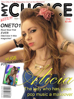
This is the first draft of my front cover of my magazine. I created this front cover on Adobe Photoshop, as I feel that this software allows me to use many tools, such as the ability to add different layers, add shadow effects and being able to insert pictures, to create a successful front cover.

I added a few things to this front cover, which were not previously on the mock up. Firstly, I added the offer 'HUGE POSTER INSIDE!" This was because my magazine was inspired by 90s pop magazines, and all of these, because of the time period, would offer a large poster for the reader. That is why I too decided to include this offer to help persuade the user to purchase the magazine. Secondly, I positioned the selling line more to the top of the page, rather that below the masthead. This was because when I had positioned it below the masthead, it would distract the user from the main image, and this is the image that is going to sell the magazine. Lastly, I decided to add the word 'only' underneath the price. The makes the magazine sound relatively cheap, and therefore persuades the user even more to purchase it.

1 comment:
There's so many positives on this cover line. Nice script text for Alicia. Good masthead. Good image, clean editing. Poster, barcode and layout are all very aesthetic.
Here's some minor points:
The main image overlaps the masthead too much. It is rare, even on Vogue, Esquire, Rolling Stone for more than 50% of the masthead to be covered. Try lowering your main image by a couple of 1cm. You amy have to amke the image slightly smaller so that you still get a shot of her waist and maintain that high angle mid shot that you have.
Make sure all the reds appear the same tone.
Apart from these couple of points, it's a fantastic production.
Well done,
Mr Lau
Post a Comment