Using Brushes 10/10/08
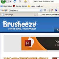
 In this lesson, we learnt how to download brushes to create a successful banner and logo for our media blog. We first downloaded a Photoshop brush from a website. I found the website Brusheezy, which allowed me to download brushes for free.
I then started a new Photoshop
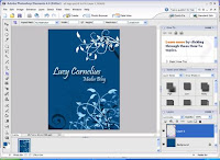
 document from scratch, and adjusted the size to A3. I decided to make my logo and banner using different floral patterns. I made the background a deep blue by filling it with the paint bucket tool. I then loaded my saved brush, changed the paintbrush colour to white, and ‘painted’ where I wanted my flowers to be on my page. I only clicked the mouse once, as this created a sharp and accurate picture of the design that I had chosen.
I then added another layer. This allowed me to draw even more brushes and designs, but I could layer them on top of my previous ones. I then adjusted the blending mode of this layer to luminosity, as this created a very transparent and more subtle effect, which I felt looked extremely professional.
I lastly added my text. I made my name bigger than the text that read ‘Media Blog’, by highlighting the layer that was just my name, and making the font size bigger. I also placed the ‘media blog’ layer below the text layer for my name, so that my name slightly overlapped the other text. This looked made my logo look very professional.
The font I chose was a script font, as I wanted to keep my logo very sophisticated. The font I used was ‘Pristina’. I also made the font white so that it contrasted well against the blue background a stood out.
I also added a drop shadow to both text layers, which just makes my logo look a lot more interesting.
I then created a new document, adjusting the size so that the length is a lot longer that the height. This is my banner. I chose to keep the background colour and used the same brush, as I wanted to achieve a consistent style.

No comments:
Post a Comment